
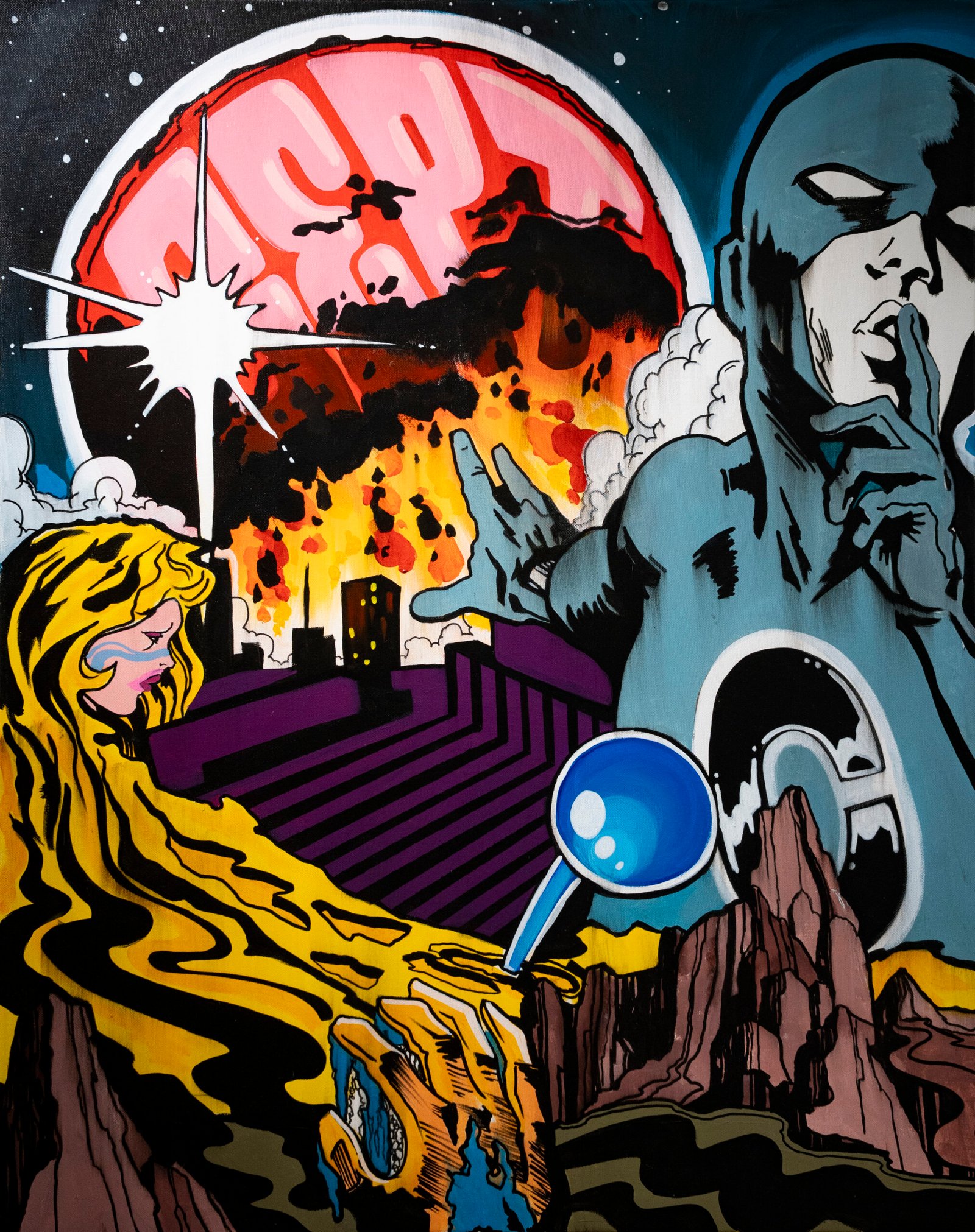
CEPT’s art arrives with the force of an image designed for the street. Colour is immediate, outlines are decisive and figures register quickly. Look for longer, however, and the first impression begins to break apart. Comic-book faces, graffiti lettering, romantic tension, fragments of popular culture and references to music occupy the same surface without settling into a single story.
That combination is the key to understanding CEPT’s art style. His work is not defined by one character, medium or borrowed image. It is built through collision: familiar material is removed from its original setting, placed beside something unexpected and given a different emotional role. Our wider CEPT artist profile follows the development of his career. Here, the focus is narrower: how the images themselves work.
How the CEPT Art Style Creates Immediate Impact
Graffiti taught CEPT that an image must compete for attention. A wall exists among buildings, road signs, traffic, advertising and other painted surfaces. The work needs enough graphic clarity to be understood from a distance, often before a passer-by has chosen to stop.
This helps explain the recurring strength of CEPT’s outlines and colour blocks. Forms do not dissolve quietly into one another. They meet with enough contrast to hold their place in a visually crowded environment. Even when a composition becomes dense, its larger shapes remain legible.
The same approach carries into paintings and prints, but the viewing conditions change. A gallery visitor can stand close to a canvas and examine transitions, overlaps and small disruptions. What functions as a bold signal on a wall becomes a more layered visual argument indoors. CEPT does not abandon graffiti’s directness; he uses it as the foundation for slower looking.
Sampling as a Visual Method
Music provides one of the clearest ways into CEPT’s practice. He has repeatedly connected his work to sampling, the process through which an existing fragment is lifted from one context and reorganised within another. The House of Graffiti documents this relationship between music, comics, Pop Art, song lyrics and art history in his murals.
Visual sampling is not the same as assembling a catalogue of references. The important moment occurs when the sources begin to affect one another. A heroic face placed beside distressed lettering may no longer appear entirely heroic. A romantic embrace enlarged across a public wall becomes theatrical, exposed and slightly unstable. A familiar lyric can change the emotional temperature of an image before its details have been understood.
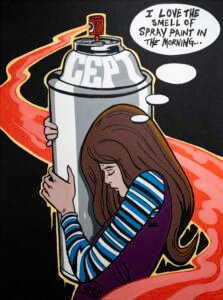
CEPT’s compositions often retain enough of the source for recognition while withholding the complete original narrative. That gap matters. Viewers recognise the cultural language but must create new connections between its fragments. The artwork operates like a remix whose components are familiar even when the finished arrangement is not.
Comics Without a Complete Story
Comic-book imagery gives CEPT a language of concentrated drama. Faces, gestures and embraces can communicate urgency within a single frame. Heavy contours make figures readable at scale, while expressions imply events that remain outside the image.
Street Art London identifies superheroes as a central focus of CEPT’s street work and notes its comic-book and Lichtenstein-like character. The comparison is useful at the level of graphic language, but CEPT’s images should not be reduced to imitation. His figures enter a wider environment of graffiti lettering, psychedelic colour, cosmic forms and music-driven associations.
The missing story is part of their effect. A viewer may encounter a couple at the height of an embrace or a figure at a moment of apparent crisis, yet the cause and outcome remain unknown. CEPT uses the compression of comics while removing the surrounding panels that would normally explain what happened before and what comes next.
When a Song Title Becomes an Image
Titles are not secondary labels in CEPT’s work. They can act as emotional cues. Love Will Tear Us Apart and To Die By Your Side bring associations with Joy Division and The Smiths into visual scenes of attachment, conflict and longing.
These connections do not mean the works simply illustrate songs. The relationship is less literal and more atmospheric. A title arrives with memories that vary from viewer to viewer: a melody, a period of life, a relationship or a particular cultural moment. CEPT places that personal response beside the heightened visual language of comics.
The result moves between irony and sincerity. Superheroes are designed to appear exceptional, yet CEPT often places them within the ordinary emotional pressures of desire, separation and vulnerability. Their dramatic poses may seem exaggerated, but the feelings beneath them are recognisable.
Colour as Structure and Atmosphere
CEPT’s colour is frequently described as loud or exaggerated. Those terms capture its intensity, but colour in his work does more than attract attention. It organises the composition. Large areas separate figures, establish rhythm and prevent complicated arrangements from becoming visually unreadable.
Colour also creates atmosphere. Acidic greens, vivid blues, reds, purples and sharp contrasts can push an image away from everyday observation and towards psychedelia or science fiction. The viewer may recognise a face or a comic-book gesture, but the surrounding palette relocates it into a world that feels unstable and unfamiliar.
This is one reason CEPT’s work can remain accessible while resisting a simple reading. The colour offers an immediate entry point. Once inside, the viewer encounters emotional contradiction and references that do not resolve neatly.
Lettering Is More Than a Signature
Graffiti lettering remains another important part of CEPT’s visual vocabulary. Letters can identify an artist, but they can also behave as shapes with weight, direction and rhythm. In CEPT’s compositions, typography and figures share the surface rather than occupying separate categories.
At mural scale, lettering can become architectural. Curves and blocks respond to the proportions of a wall, while the wall’s cracks, edges and interruptions become part of the finished encounter. On paper or canvas, the same graphic habits can be controlled more closely through layering and registration.
Words therefore operate in two ways. A song title can bring cultural memory and emotion, while a letter form can function visually before it is read. CEPT uses both possibilities, allowing language to carry meaning and to contribute to the physical structure of an image.
What Changes Between Wall, Painting and Print?
The visual language remains connected across CEPT’s murals, paintings and screenprints, but each format produces a different experience. A wall gives the work public scale, architectural tension and vulnerability to weather or overpainting. A canvas allows prolonged attention and denser combinations of figurative and abstract material.
Screenprinting introduces another logic: images are constructed through distinct layers. Bold colour divisions and strong contours suit the process, while hand colouring, stencil aerosol and artist finishing can make individual editions more varied than straightforward reproductions.
Nelly Duff’s CEPT archive documents work across originals and limited editions, demonstrating how the same underlying vocabulary can move between formats. The continuity lies not in making every work look identical, but in returning to the same method of recombination.
Seeing CEPT Through London Art Exchange
London Art Exchange currently presents a selection of CEPT paintings, including The Zen Sweepers, Space in the Place, Shadow Play, My Mistakes Were Made for You and A Love That Never Dies. Viewed together, the titles themselves reveal the movement between popular culture, music, romance and imagined worlds.
These paintings give viewers an opportunity to examine at close range qualities developed through street practice: bold contours, compressed narrative and high-impact colour. The gallery setting changes the pace of the encounter, but it does not erase the work’s graffiti foundation.
A Familiar World Made Strange
CEPT’s art is powerful because it begins with material that viewers think they know. Comics promise heroes and complete stories. Song titles arrive with existing memories. Graffiti lettering carries its own history of identity, territory and public display. Pop colour suggests accessibility and speed.
CEPT reorganises those signals until they become less certain. Heroes appear vulnerable. Romance becomes excessive. Lyrics take on new visual lives, and familiar figures are placed inside cosmic or psychedelic environments. The work remains readable, but it refuses to become predictable.
That tension distinguishes CEPT’s visual world. Its sources may belong to popular culture, yet their new relationships are personal and unsettled. Like a strong musical sample, the image remembers where it came from while becoming something capable of standing on its own.